This is an example of a PPT deck designed to gain a new piece of an existing client's business. The curved boxes and typeface are all Teneo, however the approach was to incorporate elements of Vodafone's brand along the way, to achieve a 'hybrid' effect.
This project was presented mainly in the client's branding, however also using a hybrid approach to incorporate element of the agency’s brand to stand alongside . KPMG have a very bold and varied colour palette, which enabled me to use eye-catching gradients and effects.
The finished product utilised the Morph transition effect to focus on the subjects’ faces around a meeting room table, moving seamlessly from slide to slide.
Click here to download an animated version (please enter Slideshow view after opening).
This is an example of a standard client update meeting deck for Teneo. The emphasis is on clarity, delivered in PowerPoint, however mockups and illustrations created in Photoshop and Illustrator.
Downing’s annual report on Sustainability and Reponsible Investment in the industry.
Designed in InDesign, with use of Photoshop for images and utilising Illustrator for financial charts.
PowerPoint presentation for a media planning and buying proposal to Transport for London.
With the carbon fuel industry becoming more limited, Italy's largest power company is looking to the future - sustainability. This strategy update was presented to key stakeholders and included a personalised QR code linked to a microsite with further information.
A recruitment publication for Norton Rose Fulbright’s graduate recruitment scheme in Germany.
A market trend update provided to CocaCola by SCB. While infographics and composite images were created with Photoshop and Illustrator, the final product was produced in Powerpoint to allow the team to edit the document.
A fully interactive, responsive PDF with three levels of navigation. While many of the graphics were created in Creative Cloud, the end product was required to be in PowerPoint to allow the client to be able to update themselves.
led on the creative concept and created a series of infographics throughout, combining both the PwC and Shell brands.
A quarterly report for EY commissioned by EuroTunnel. Created in InDesign and Illustrator to produce a clean, concise document, punctuated throughout with infographics quality bespoke photography and illustrations.
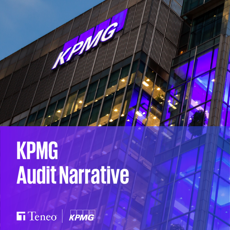
A proposal document for a large audit tender by EY, designed in InDesign and Illustrator. Using the concept of 'The Right Combination' of EY and Big Yellow Group, the brief for the pitch document was to be clean, modern and eye-catching, combining elements of both the EY and BYG brands.
Spectrum, BNY Mellon Investment Management’s flagship product in the APAC region, offers institutional access to leading investment advisers for high net worth investors in Asia for the first time.
I was involved in the creative process from the beginning, leading focus groups, art directing the look and feel of the product, developing the website in conjunction with an external agency and designing the marketing literature. I was also responsible for managing the website’s CMS post-launch.
To highlight Scotland's emerging digital economy, EY partnered with the Scottish government to curate an event bringing together industry and government leaders.
The entire event was paperless, with session information, agendas, speaker biographies and event materials updated before, during and after the event, accessible via the web, iBeacons and Augmented Reality via Aurasma.
A corporate re-branding project for Rocket, a leading UK media agency. The design rationale for the mark revolves around the principle of the optimum trajectory for a rocket to achieve maximum distance as being at an angle of 45 degrees.
The brand was applied across all channels including digital, print and social media.
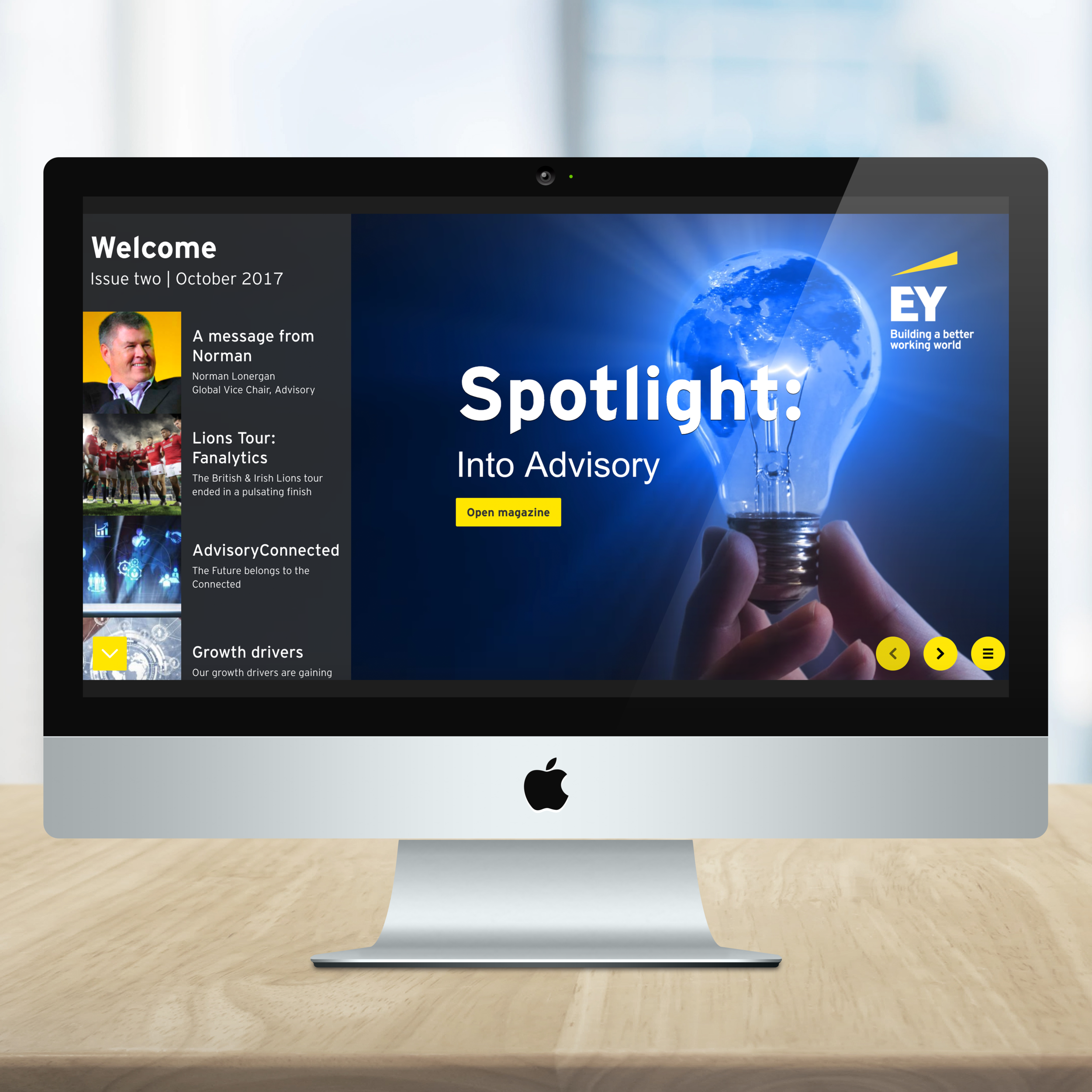
As part of EY’s ‘Digital First’ strategy, I led on the adoption of the Foleon CMS platform, which bridges the gap between Print and Digital. A key component is that this is fully responsive - functional on desktop and mobile devices.
This internal magazine was distributed to all EY Advisory staff globally.
A key component of this project was utilising Google Analytics to track the demographics of visitors, including geo-location, device and browser.
A simple and easy to digest investment guide for distribution to existing clients and prospects in the retail market, explaining the investment process.
A redesign of an existing pitchbook for use at meetings with prospects. The deck's design was based on Tetris, with each component of an investment portfolio represented by a different shape - all ultimately fitting in together to achieve alpha.
A box-set of strategy booklets designed to illustrate PHD’s ‘Human Touch’ approach to all facets of its business, including media planning and presenting award submissions.
The brief called for a simple and clear, yet eye-catching design to fully focus the reader's attention on each key message.